Pens
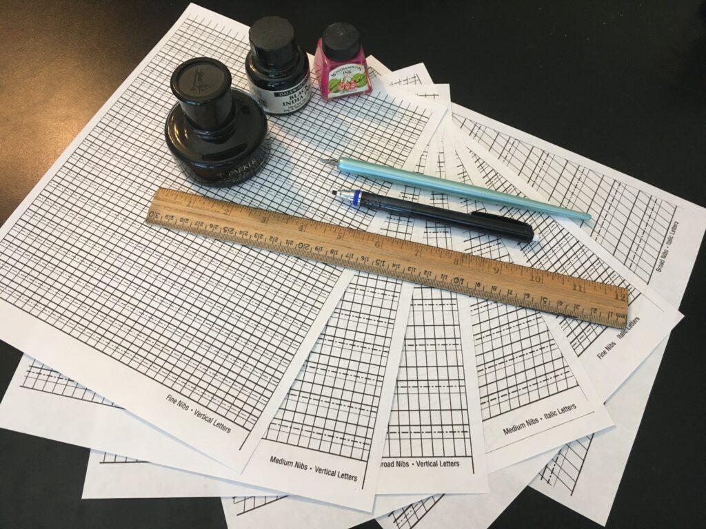
This section is for dip pens. Cartridge pens can be used, though size matching can be difficult. They also use acryllic ink which are non-ideal but still okay.
Since nibs and pen sets can be a huge investment, don’t be afraid to ask a local scribe, or someone in a scriptorium, if you can play with theirs before dropping money on your own. Many scribes actually carry multiple types of pens so you can compare and contrast.
There are MANY brands of dip pen sets. Of the most accessible ones, there are Speedball, Mitchel, and the Walmart make. A lot of people like Speedball since they write so smoothly and have built-in reserviors, but the issue we have with them is that most store-bought sizes aren’t small enough (and since some of us use corosive inks and the reservoirs aren’t detachable, it can make them not last as long). They’ll run you $13-15 at most craft stores. Mitchell/Manuscript will also run $13-15. They come in a wider array of sizes but use a separate reservoir that sits on the bottom and annoys many people (though many people simply don’t use the reservoir and the pen works just fine). The Walmart nibs are pretty much the same thing as Mitchell except no half sizes and the nibs are plated. They can give less crisp letters, but they last forever and only cost $8-10. They are hard to use if you are not heavier handed though as they are rather stiff. The holder that comes with these is much larger and better for people with hand issues, but the slot the nibs slide into can be hit and miss, but easily fixable with some clever gluing.

Other sets are usually only available online. This means you can buy the handle that you like and then the nibs you like, especially if you use more of one size than another. A great place for specific ordering of nibs is John Neal Books but you can find them elsewhere. Brause are great if you are heavy handed since they last FOREVER but are hard to use if you’re light handed. Tape is also a great brand. You can get nibs for Speedball (including smaller sizes) and Mitchell here too, though not of the Walmart brand. Those only come in the kits.
You can mix and match. One of our scribes describes her pen as a “Frankenstein pen” which uses the Speedball handle, Mitchell/Walmart nibs, and a Tape reservoir (if one is being used at all) since they sit on the top and don’t get in the way.
Ink
Calligraphy inks may be water-soluble or lacquer based. Water based inks are easier to use, flowing easily and rarely clogging the pen. They can be had in various degrees of fade resistance.
Lacquer-based Inks; such as Higgins Black Magic or Higgins Eternal are acrylic and largely fade-proof, as well as being water resistant and very black and even. They are hard to use in fill-pens although some companies make such pens especially for India inks because of drying and clogging the nib (clogged nibs can be cleaned with a solution of ammonia and water, or Palmolive dish-washing soap and a toothbrush).

While lacquer-based inks can be used, it is not suggested since it can chip in the cases. India Ink can be used, though it may need to be watered down before use in a separate, small container. Another option is Sumi Ink (beware of those that contain shellac), which is very cheap and very effective, If it’s too thick, add water. If it’s too thin, let it air dry out of reach of children and pets. Winsor & Newton inks are great too, though stick to black or red only as the others are kinda goopy.
Lamp Black Ink, such as Sumi ink sticks, is a medieval ink. Rub the slick on a stone with water until it is the right consistency for ink. Lamp Black Gouache can also be used in dip-pens for calligraphy.
Oak Gall Ink (also known as Iron Gall Ink) is the most common ink used in medieval manuscripts. Oak gall ink can be bought in liquid form from johnnealbooks.com or easy vendors such as Ian the Green. A make-at-home kit can be bought from Guild Marandola at Pensic. Ink can be made from scratch using Palantino’s recipe found in Scribes and Sources by A.S. Osley.
Palantino’s Oak Gall Ink Recipe,1540
“To make ink, take 3 oz galls, which shall be small, solid, and wrinkled, and crush them coarsely. Steep the in half a flask (1 ⅝ pints) of wine or, better still, of rainwater and allow them to soak in the sun for a day or two. Then take 2 oz of copperas (ferrous sulphate) or Roman nitro of a good and rich colour and finely crushed. Stir the galls with a stick of fig-wood and add them in, leaving the mixture in the sun for a further day or two. Now, stirring the mixture up again, add an ounce of gum arabic, which should be clear, lustrous, and well-ground. Leave a whole day. To make it nice and bright, add a few pieces of pomegranate peel and bring to the boil over a very slow fire; then strain it and keep it covered up in a glassed a lead container; and it will be perfect.”
Hands
There are many hands in medieval calligraphy but these listed below are the main ones:

- Roman Rustic – 1st to 6th century
- Uncial – 3rd to 6th century
- Artificial Uncial – 6th to 10th century
- Roman Half-uncial – 3rd to 9th century
- Insular Majuscule – 6th to 9th century
- Insular Minuscule – 6th century onward
- Luxeuil Minuscule – 7th to 8th century
- Caroingian Minuscule – 8th to mid 12th century
- Early Gothic – 11th and 12th century
- Gothic Textura Quadrata – 13th to 15th century
- Gothic Textura Prescisus – 13th century onward
- Gothic Littera Bastarda – 13th century onward
Calligraphy in Text Box
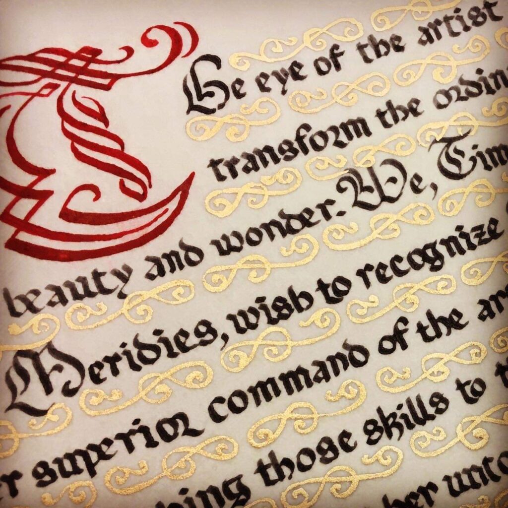
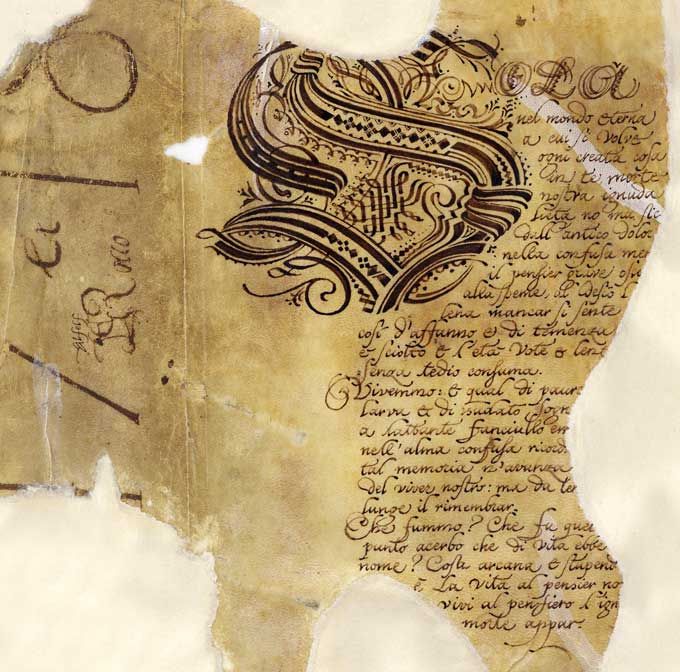
This information can also be found in the text box section under “Scroll Anatomy” but bears repeating. There should be enough room in the text box to fit the scroll wording and space for the signatures and seals. The calligraphy hand should match the style of the design whenever possible. An early period illumination should have an early period hand that would have been used at that time, if not a hand based off of the calligraphy used in the manuscript that the illumination came from.
If the correct hand is not in your repertoire, network with other scribes in the Kingdom and find someone who is a calligrapher that knows the appropriate hand. In period, calligraphy and illumination were frequently done by separate individuals and working with another scribe can be highly rewarding.
Be kind to the herald and include a typed or printed transcript of the wording for the Herald to read in court.
A good resource for calligraphy is Mark Drogin’s Medieval Calligraphy Its History and Technique, the Calligraphers Bible by David Harris, and the Art of Calligraphy by David Harris, etc.
A free download copy of The Art of Calligraphy by David Harris is available at Scribd at the link below.
Also available for free download is David Harris’ Calligraphy Bible. Search google for a free copy
Things to consider when laying out the text space.
- Letter spacing
- Height of letters
- Width of letters
- Line spacing
- Paper size
- Text block size
- Text Box Margins
- Double columned page

Suggestions: write out the text in pencil first to see if any alteration is needed in the text to fit in the space available.
Another option is to recreate the text box dimensions on a separate sheet of paper and ink out the text using the hand you intend to use in the final product. This will give you a chance to make changes before adding to the final piece as well as practicing the hand. It is common to omit letters and words when writing the text as one begins to focus on the strokes and not the words. Practicing the text out beforehand as suggested can help mitigate that propensity. Also, if the lettering is done before the painting is started, it will not hurt as much to discard and start over in the event that a word is misspelled or left out, or the ink is accidentally smeared.
Once the calligraphy is to your satisfaction, move on to the next step.
